 |
| The second of my BBC Luther posters 'Découpage' [Pencil and Photoshop] |

Tuesday, 17 December 2013
Wednesday, 30 October 2013
LUTHER Process
I always enjoy seeing artists' processes and, as the process I used for my BBC Luther work was so basic, I thought it would be useful and encouraging to any beginners to digital painting out there to post the step-by-step. Hope it gives someone help, even just a little bit to one person out there!
Here is one finished portrait used for my Luther#1 poster of the character DCI Ian Reed.

 |
| Source Material - this is the photo I based my painting on, at its original size (I know!). I don't mind smaller images to work from as it simplifies it before I start my own simplistic drawing. It also allows me to add my own details without getting blinded by the original's. As you might be able to see, looking at the final, simplifying was partly the colour tones, choosing my own blues, more on the slate side, and keeping from drawing too many lines, particularly from the coat collar. |
 |
| Pencil Drawing - on A3 watercolour paper, 4H and 4B pencil. As I was going for a comic look in the final piece I made all of my lines strong and angular. The eye on the left was a little off which I could correct in the next stage.... |
 |
| Inking - to mimic comic book art and artists I inked over the top of my now-scanned pencil drawing in Photoshop. My digital ink was a little paler than solid black (personal preference) and done with my new favourite 'round angle' brush which felt akin to using a brush pen as I would in real life, but with less smudges. |
 |
| Base Colour - here you can see my palette, cold blue, very much towards purple end of the colour spectrum. With each portrait on the poster I used a similar colour palette within the image, to separate them and again to keep it visually as simple as possible. Simple = bold. |
 |
| Shading - from here on it's a matter of adding new Photoshop layers per colour I use, only as there are so few. This stage is the mid-tonal shadow; the tone between the deep dark shadows and the softer lighter shadows. Note that I used this tone to create the details of wrinkles on the face rather than drawing them in at the 'inking' stage. To create the look of bigger brushier strokes I used a 'fan' brush. I also used a layer for a pink shade to add variety and more of a touch of realism, to the lips, nose and around the eyes. |
 |
| Highlights - here is the other end of the shading! I prefer to do shading and highlighting to add depths before I get involved in all of the iddy-biddy mid-tones. Not too iddy-biddy though, keeping it simple remember! Keep bold whites to a minimum unless your portrait is being blasted by sunlight or is a cartoon geisha. You need places on the spectrum to go to. |
 |
| Light Bounce - after finishing all the shading stemming from the base colour palette I add variance by reflecting the environment's lighting - more blue! I lower the opacity on this colour to blend in with the skin tones; keeps it a softer, more natural look. In more realistic paintings this detail of environmental light reflecting off your subject creates a sense of realism that can easily be overlooked and makes a HUGE difference. I easily neglect this after drawing too many cartoons from my head but is important to remember. |
Saturday, 5 October 2013
LUTHER
I've begun to plan a poster for BBC's tv series 'Luther'. I've begun by sketching portraits of the show's various characters in a very basic, linear style; I want to replicate a comic book style illustration for the final piece. Whatever that may end up being...


Tuesday, 17 September 2013
Menu Illustration

Something I worked on in between Wales, Paris and moving. I'm settled now so I'm drawing now. :)
This looks better than I thought it'd turn out, but I'm not happy with the composition overall. Guess I ran out of steam. Think it needs a few more details, possibly - what do you think? What was your first thoughts?
This looks better than I thought it'd turn out, but I'm not happy with the composition overall. Guess I ran out of steam. Think it needs a few more details, possibly - what do you think? What was your first thoughts?
In the mean time I'm onto the next self-directed project:
comic-style posters of BBC's tv series, Luther!
Initial pencil sketches on here very very soon...
J.x
comic-style posters of BBC's tv series, Luther!
Initial pencil sketches on here very very soon...
J.x
Sunday, 8 September 2013
Happy Birthdaaay...

A week before his birthday L.H. told me he thought he looked like a llama - what a foolish mistake to make!
Really fun to draw and keep secret. He took it very well, the lovely man.
You've not heard from me for a while as I've been busy moving in with said llama, had a trip away with family, then another with llama, then REALLY moved in. And we have the internet here now! Getting back into my routine, and there are a couple of things I had been working on before the hectic weeks began. Expect to see more drawings soon :)
J.x
Friday, 26 July 2013

Tuesday, 23 July 2013


Thursday, 18 July 2013
Onwards and Upwards: Self Portrait 2

Aimed for a more villainous/femme-fatale look. Much colder than my last piece, still made the skin feel real in tone, but the facial features are more solid than real life. I feel I rushed this one a bit; only done in a few hours, then abandoned, then edited for a few more hours. Sometimes a break to step away gives clarity in my judgement, but other times.....
I enjoyed the warmth I created in the first. Maybe this one isn't cold enough, not sure. I still struggle with noses too. I can't get my drawing head around the geometry of nostrils (which is why I chose an upwards angle). I understand feet and hands better than noses. D:
Don't like, but learning.
I enjoyed the warmth I created in the first. Maybe this one isn't cold enough, not sure. I still struggle with noses too. I can't get my drawing head around the geometry of nostrils (which is why I chose an upwards angle). I understand feet and hands better than noses. D:
Don't like, but learning.
J.x
Sunday, 7 July 2013
Self Portrait

It feels like it's been ages since I've posted anything online anywhere. I suppose it has! I'm not feeling bad about it, as there's a lot going on at the moment without the Internet being in my life too much. It's also necessary for me to focus more inwardly on my work at times rather than putting it out online for all to see, as my way of approaching ideas can tend to turn towards crowd-pleasing, which isn't ever my aim.
For the past couple of weeks I've been in the process of designing a video game poster, and after a lot of pencil sketches, research and messing around I got into a rut. Final layout is sorted, final character design is decided, but then the style... My line work wasn't clicking with weak and wonky geometry and blah blah blah, so I took a step back to focus my artistic energy in another aspect towards the poster: skin tones.
I've never really stretched myself in varying light sources in my work or defined them strongly. I knew that this would be fun but also important. I took a few reference photos of myself with a strong upward light and set about a quick-ish painting practise.

Completed entirely in Photoshop, my image was A5 page size at 300dpi. I started of with a layer of the base skin tone with a layer on top of that for the background and began to carve out the figure out of the dark tones to reveal the skin tone. I slowly built layers of details and tonal values on individual layers from there. I was pleasantly surprised with my translation of the photo to painting; despite using very different techniques and mediums it turned into a similar style to my pencil sketches for the poster.
The more I've practised and researched and practised some more I have begun to get to know myself and find my own style rather than attempting to imitate someone else's - which I enjoy doing! And I never outright copy a style, but pick up bits here and there. However, this time I've been relying solely on my own judgements when I get stuck for a moment. I'm looking forward to applying all that I'm learning into one large piece of work.
J.x
Sunday, 19 May 2013

Friday, 17 May 2013

Monday, 13 May 2013


Sunday, 12 May 2013
10 Minutes to Midnight

I sketched out a draft picture for a few hours tonight before turning it into a full coloured painting.
Then I doodled this face in ten minutes before it was time for bed and I like it more than my hours of work.
That's just how it goes some times, I guess!
She looks the way I feel about that painting...
I'm sure I'll have something to show for it soon.
Good night!
J.x
Monday, 6 May 2013

Sunday, 28 April 2013
Dressing Andona

I've been continuing working on my old 'Andona' project in my evenings.
If you saw, my textiles designs are what I applied to these characters for some quicker detail and variations.
This is the first variation sheet; next is a dirtied worn-out look. The Andonians are a part of a desert colony, filled with vibrant and earthy colours from natural dyes, dressed in raw cloths, sparsely bejewelled in simple metals. Resources aren't vast, poverty stricken by their ruler, and life is tough, broken down, everything faded and worn away.
J.x
Monday, 22 April 2013
People of Paris #2

Seen in the area around Shakespeare&Co. Bookshop
A very cool-looking, nigh-cliché, Parisian couple.
He looked around 50 and she looked around 30.
I don't know if it's coincidence or a slight cultural difference but several times I had sincerely thought:
"That's so sweet, a father hanging out with his grown-up daughter! Ohhh... Oh, I see..."
"That's so sweet, a father hanging out with his grown-up daughter! Ohhh... Oh, I see..."
J.x
Saturday, 20 April 2013
People of Paris #1

Seen around the Marais.
A fuzzy coated kid punching her dad.
He didn't react.
J.x
Jessica In Paris


If you've been to Paris, don't be shy, tell me what you loved - or didn't - about your visit!
The whole trip in brief:
DAY 1: Sacre Coeur > The Espace Dalí > walk around Montmartre > BD Spirit comic book shop > Montmartre Cemetery > Dinner at Chez Marie
DAY 2: Patisserie on Rue Raymond Losserand > The Eiffel Tower > Champs de Mars > L'Hótel National des Invalides > Lebanese Restaurant
DAY 3: Ile de la Cité, a walk along La Seine > Notre Dame Cathedral > Gallerie Lafayette > Maison du Miel > Place de la Madeleine, Boutique Maille, Bistro > Musée du Louvre > Champs-Élysées > Arc de Triomphe
DAY 4: Saint-Germain-des-Prés > Jardin du Luxembourg > Panthéon > 5th Arr. Delis and Markets > Shakespeare and Company Bookshop
DAY 5: Exploring Le Marais > Food from L'As Du Fallafel > Sitting in Jardin des Francs-Bourgeois > Pompidou Centre
The Espace Dalí
Around Montmarte on the back streets below Sacre Coeur, the museum had a great collection of Salvador Dalí's line drawings, paintings, collages, videos and sculptures. When looking at his work I read his sense of playfulness and uses of symbolism as being very personal and honest, answering to no one else.
While there a class of Parisian 4-year-olds were shown around with percussion instruments(?!) in hand. I don't think children so young in England are ever given these types of trips, or at least not to places that aren't aimed at children specifically.
BD Spirit
I didn't buy anything from this comic book shop, because where would I start? It looks fairly small on the outside but it really packs a wide variety of comics of all genres from over the years from the well-known to the new. I'd recommend any art and illustration lovers to check it out.
L'Hótel National des Invalides
What a gorgeous place. It is simply massive; we couldn't get around it all, including Napoleon's tomb. We managed to see the Napoleon exhibition (and one of his horses stuffed and falling apart) before closing time where we saw the coronation jewellery of Joséphine de Beauharnais, his many tomes, marble busts and then there was this, in person:
 |
| Napoleon Crossing the Alps by Jacques-Louis David |
Day 3...
In one day we saw Notre Dame, Gallerie Lafayette, Louvre, Arc de Triomphe and walked by Eglise de la Madeleine and Opera National de Paris. No photos do any of them justice compared to strolling around with such grandiose historical buildings looming over you at what feels like every turn. Ugh. It's all amazing.
We stopped off in a bookshop where we found The Complete Costume History, which is now in my loving possession thanks to an even more loving L.H. It's a great form of reference for me to get on with bulking up my costume design portfolio and I'd highly recommend it to anyone interested in costumes and clothing throughout history.
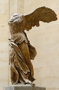 |
| Winged Victory of Samothrace |
Yet another enormous place filled with things we just couldn't see all of! Entering the glass pyramid in daylight and leaving at night with everywhere around you lit up added to how magical it felt to be there. One of the first things I stared at for a long time when we arrived was the statue 'The Winged Victory of Samothrace'. It's such a powerful image, I can hardly believe it's so old, dating back to 190 B.C.
Yeah, of course we saw the Mona Lisa, how could we miss her? She had a bustling crowd around her eagerly taking photographs.
But I was more enamoured with my new favourite artist, Anne-Louis Girodet, after seeing his painting 'The Deluge'.
 |
| The Deluge - Anne-Louis Girodet |
I wish I had written down a few other names too, but the paintings rather than the artist are what will stay with me in the end anyway, whether I know their name or not.
There were whole areas of the Louvre we didn't get to explore. We'll definitely have to go back again.
This had to be the most exhausting gallery experience. More than Louvre. Firstly, the building is fantastic to see with giant multicoloured piping decorating the outside. Inside it was wide open spaces, escalators, and 3D moving sculptures. It was the opposite of everything we'd been to during our stay. There was just too much to see in one visit, and with work by so many differing artists, we couldn't take it all in.
There were a lot of recognisable pieces: Picassos, Matisses, Kandinskys...
We looked around the Jesus Rafael Soto and Alina Szapocznikow exhibitions.
I found Soto's work was hypnotic and alluring, enjoyable from all angles, whereas I found Alina's too personally expressive for me to respond to. It was very much her internal expressions and sketches, not final work designed for display, which I always find funny for an exhibition. It was more of a visual autobiography. My personal highlight was seeing a few of Yves Klein Blue pieces. It was like I saw a celebrity.
 |
| View from the escalators in Centre Pompidou |
Obviously I don't think I can design and build a palace that will last through the ages, but I can do more than I am doing now. I can push myself to be greater, to be the greatest I can be in a way I want with what skills I have and not for any other reason than 'because I can'. So much of my work is spent in thought before beginning to sketch or paint and more often than not it is all apprehensive thought. What style should I try to emulate? What if it's not as good as last time? Who will like this? What if today I can't do it? How can my work reach more people? And this is all down to the years of pressure thinking ahead to the future. I forgot to live in the now, and therefore my drawing is neither in the moment.
For my next post I have a few sketches of people that we saw on our wanderings.
It's such a beautiful city with so much to see (and eat) we can't wait to go again.
So, Paris. It was a much needed get-away; rather than leaving behind everything at home, I most needed a step back from myself and to dive into other creative minds. I realised that the way I've been thinking while I work hasn't been as truthful or as passionate as I had hoped but I still can be.
J.x
Monday, 1 April 2013
Fabric of Andona
Hi everyone,
Have you had a good Easter weekend?
I've barely begun eating my chocolate!
For the last couple of weeks I've started to really get back into my Andona project, which was my second year project at University (see here and here).
I didn't feel I had done enough thorough character designs and haven't dedicated my work to finer details.
To begin costume designs for the people of the planet Andona I created textile samples.
I really enjoy creating patterns, something I only realised a year ago. There's something quite therapeutic about creating them.

I've already sketched a page of characters ready to use these patterns on them. It creates a very quick and easy way to make variables for each character design.
So, I'm getting ready to leave for Paris tomorrow morning for 6 nights with L.H.!
I'm very excited to make some artistic discoveries! But, like the art geek/workaholic that I am, I'll miss working on my projects. I'm taking obligatory moleskins and camera, of course :)
Au revoir for now.
J.x
Friday, 15 March 2013
Mr Little
In case you didn't see me post this on every other online thing possible...
A portrait of Omar Little from HBO's The Wire - if you've never seen the show before what have you been watching all your life?!

It wasn't quite what I'd had in mind, but I think it actually ended up better than I'd planned. The picture I had in my head was mainly the multicoloured scratches, which I've got, so I'm happy!
I've been neglecting my blog quite a bit this year. It's been my own fault for keeping things secret; I've not been sharing progress and processes so as to not spoil any surprises for people.
I can tell you what I'm working on though:
- 2 costume design mini-projects
- a comic strip for my other gentleman half
- pin-up style portraits of my girl friends
- quick designs of my character Andi from my Andona project
- ideas and scripting for a graphic novel (check back with me in 10 years)
- sketching and painting for fun in between
- and then there's the next TV portrait! I've not done a film portrait yet - any suggestions?!
All that on top of working full time and trying to keep up learning languages. It is tough and slow!
I do love personal challenges though, so I'm enjoying the struggle in a twisted kinda way.
What are all you guys working on?
Do any of you keep things secret until a certain point of completion?
J.x
P.S. I'm now on Tumblr and Society6
Monday, 4 March 2013
Baddabing baddaboom!

Furio Giunta from HBO's The Sopranos.
I painted this a couple of months ago. Purely for fun and practise!My two aims were: achieve a cartoon style; design a pattern.
Like my previous 'Al Swearengen' image I enjoyed using a solely 2D pattern/texture with (very basic) shading giving a sense of 3D.
I've now made this available on my Society6.
If you know any Sopranos fans in need of a very classy and beautifully artistic pillow that's the place to get it ;)J.x
Subscribe to:
Posts (Atom)